Immobiliare Le Signe
Giving trust a shape through design
- Client
- Immobiliare Le Signe
- Work
- Logo design, website
- When
- 2021
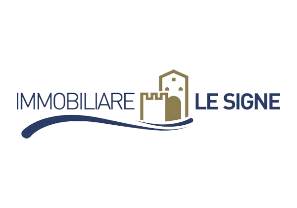
In real estate, the image has to carry two things: stability and roots. For Immobiliare Le Signe we designed a visual identity resting on a stylised architectural iconography, where the outline of the medieval towers points straight at the roots of Le Signe and conveys protection and steadiness. The chromatic balance between navy blue, standing for professionalism and trust, and sand gold, which evokes the elegance of the local stone and a premium positioning, defines a mark that stands out by authority. Completed by a fluid line at its base suggesting movement and territorial continuity, the logo is a synthesis of tradition and modernity, and gives the agency a coordinated presence at every touchpoint, from roadside signage to digital communication.