Mapel Pelletteria
Artisan nobility in a single mark
- Client
- Ma.Pel Pelletteria Srl
- Work
- Logo design, website
- When
- 2022
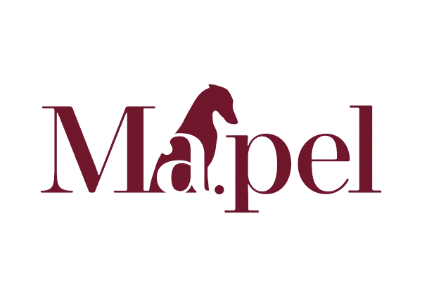
The Mapel logo is a sophisticated piece of integration between type and symbol, where the artisan elegance of fine leather is evoked through a careful use of negative space. At the centre of the composition the silhouette of a greyhound emerges fluidly between the letters, fusing the name with an icon of nobility and movement that recalls the refinement of high-end products. A modern serif with strong contrast in its strokes gives the mark an institutional, timeless character, right for a position in the luxury sector.
Mapel's new face online
Building the website for Mapel Pelletteria was a challenge we took on gladly: translating the highest level of Tuscan craft into a digital experience to match. For this project we chose a minimal, sophisticated design able to give visual weight to the care for detail that Mapel brings to every piece, from the finest leathers to its Fabbrica 4.0 processes.
We designed a fluid, intuitive interface that is not a shop window but a door into the world of Mapel. Through an optimised layout and navigation built to maximise the connection with the visitor, we paid tribute to a production cycle that joins passion to advanced technology. The result is a digital ecosystem that reflects what is singular about the brand.