SE.AL.
Visual engineering
- Client
- Se.Al. Srl
- Work
- Logo design
- When
- 2021
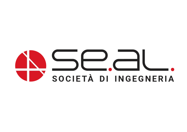
The logo for SE.AL. Società di Ingegneria was not a drawing but a structural project. The challenge was to distil the complexity and precision of engineering into an elementary, powerful icon. Everything turns on the construction of the circular emblem, a rigorous visual process that gives the company's philosophy a form.
The geometry of the SE.AL. mark
We isolated the A of ingegneria, the load-bearing element of SE.AL.'s identity, and broke it into its geometric components. Through subtraction and millimetric alignment, the lines of the A became the visual beams and uprights inside a circular perimeter. The white lines that segment the red circle are not arbitrary: they are construction grids forming a solid, dynamic structure that joins geometric precision to chromatic energy. The result is an icon that not only stands for the letter A but communicates robustness, method and design vision at once.