Super Ciao a Tutti
Italian has never been this pop
- Client
- Superciao Tour srl
- Work
- Logo design, book covers, project graphics, website
- When
- 2024 – 2026
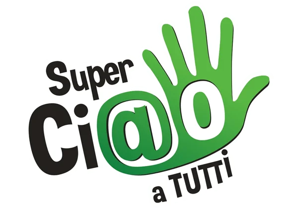
We created the visual identity of Super Ciao a Tutti, a series of books for American middle and high school students who want to learn Italian dynamically, away from the usual academic patterns. The aim was to bring down the language barrier through a universal visual language: fun and modernity. At the heart of the project is the logo, made to be instantly recognisable and friendly. An open waving hand, the universal sign of welcome, also recalls the Italian gesture; the at-sign folded into the word Ciao is a visual bridge to the digital world of teenagers; the graded blue and bright green carry energy, freshness and confidence.
Cover design: a look at the young world
For the covers of the volumes we developed a high-impact layout. The aesthetic nods to comics and contemporary illustration, with firm outlines and a visual hierarchy that puts the title and the learning level at the centre. The contrast between the ground and the green logo makes sure the book stands out on the shelf and in digital stores, catching the eye of students and teachers alike.
Tour operator branding: movement and tradition
The Superciaotour logo was conceived as a cultural bridge between the students and the authenticity of the Italian landscape, fusing architectural symbolism with movement. The tricolour arch recalls the classical structures and porticoes of Italian towns, standing for an open welcome, while the stylised aeroplane crossing the flag evokes the experience of travel and the personal growth that comes with discovery. The whole identity rests on trust and professionalism, through an institutional midnight blue and a modern typeface.
Superciaotour goes digital
In line with the visual strategy developed for the physical stands, the site works as a dynamic, immersive platform for high-profile school and educational travel. We designed an interface that is not a shop window of destinations but an experiential portal, where the idea of travel as growth is carried through multimedia content such as virtual tours and tailored educational projects. The clean design and intuitive navigation let teachers and students explore not only the great Italian cities of art but also less trodden routes and European itineraries.