Macelleria Ceccatelli
Behind every logo there is a story.
- Client
- Macelleria Ceccatelli
- Work
- Logo design, coordinated identity
- When
- 2021
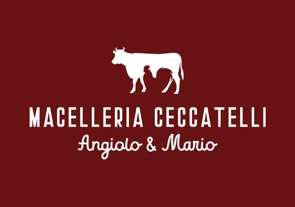
The logo of the long-established Macelleria Ceccatelli is a visual tale, an image that fuses two worlds: the ox and the cockerel. A play of solids and voids, of red meat and white, joined in an elegant graphic synthesis. The design is carried by a careful mix of typefaces, one solid for the name and a warmer one for Angiolo and Mario — a direct nod to the family, artisan soul of the shop. And finally a palette rooted in a deep, natural red, like the best cut.
And where the identity makes itself noticed, the business card manages to surprise and raise a smile: it is cut in the shape of a slice of salami. A touch of irony and originality that makes the butcher's image not only memorable but irresistibly appetising.
A mark that joins tradition to visual identity
The visual identity of Macelleria Ceccatelli reaches every detail. The outdoor sign joins wood and metal, recalling the artisan tradition, and gives prominence to the logo and to the names of Angiolo and Mario. The window graphics state the flagship products clearly — cooked preparations, traditional cured meats — drawing customers in with a clean, lively design.
The project also included the running of the social channels, with visual content and tailored posts made to tell the daily life of the shop. A concrete example of how a brand identity can communicate with simplicity, invention and consistency, and build a lasting bond with customers.